Digital America interviewed Quincy Kmetz in April 2024 about her work Hyperreality.
:::
Digital America: Your work deals with transhistorical issues, specifically involving information, technology, and power structures. What criteria or process do you follow to guide your selection of these issues in your art?
Quincy Kmetz: My inspiration for this type of transhistorical synthesis ends with looking around myself, and asking “Has this happened before?”. When these decisions start, they happen quietly while I’m working, without much seemingly intentional thought. For example, in my painting Weaponized Confusion (completed January 2021), I chose to illustrate the January 6th attack on the United States Capitol Building just because it felt important, only to step back and understand that I had decided to illustrate the most recent consequence of information warfare—a prophecy that keeps repeating itself. How many instances of politically charged violence based on misinformation can you name in the last 24 years? In the last century? We can surely name them all the way through our ancient world. I choose to pay attention to what feels important; often what is important is not unique.
DigA: Jersey City, New Jersey is located very close to two major cities in the United States, New York and Philadelphia. Has this influenced the trajectory of your current and ongoing projects that deal with issues involving information, technology, and power structure?
QK: I like to call Jersey City the unofficial 6th borough of New York. Just outside of it, the skylines of Manhattan and Jersey City blur together, almost indistinguishably. When I think of Americana, American History, American Revolution, I think of Philadelphia. You can feel the ghost of 200+ year old American hope for the future still there in the cobblestone. I think of that, and then I look out the door at Manhattan, and then all I see is a black hole. Information, technology, and power structure latch onto New York to grow like cancer and consume everything it touches. In New York we have empty high rises. Even if they’re empty, there’s someone behind their glass—these are people who know something, have something, know someone you don’t, and that’s what gives them power over everyone (literally) below them. New York is a star with gravitational force that brings everything in and then burns it to nothing, just like all societies that champion the excess. Philadelphia is one of many origin points in American history that still feel that way. And New York? There’s the undertone of just trying to survive while knowing you’re treading water in a whirlpool draining out, and no one knows where, or when, it will go. These cities reiterate the trajectory of my ongoing projects.
Dig A: Your work embraces a layout reminiscent of old propaganda posters and comic strips. Through the strategic use of bold colors and a layout that feels digitized, it evokes a blend of nostalgia and modernity. How do you think this deliberate aesthetic choice influences the way viewers interpet and engage with the depth of your work?
QK: Hopefully, my artistic decision of blending nostaglic and modern design elements into this work further drives home the transhistorical backbone of Hyperreality for viewers. I hope one day the style in which these works are painted is not what “dates” them, but the content of their imagery. I’m an artist who wants to walk the line of making work for the “Right-Now” that still withstands the test of time and taste. Ultimately, even if this endeavor is unsuccessful, I want above all for my work to excite. Comic strips and propaganda posters have jobs: excite and entertain. Not all paintings accomplish this (nor do they have to), but I want mine to.
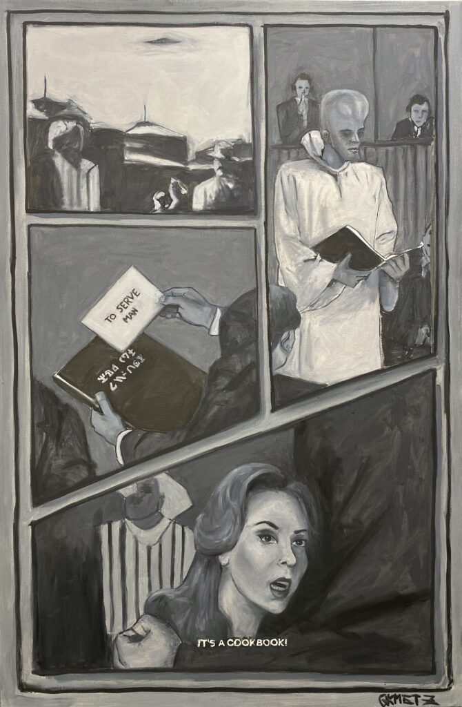
To Serve Man
Dig A: Your work, such as, Hyperreality, uses muted colors with small details of vibrant colors. How did you arrive at the decision to use vibrant colors where you did?
QK: A little known Hyperreality fact is that each painting’s palette comes directly from “House Beautiful Colors for Your Home: Expanded Edition”—an interior design book, meant to aid in choosing paint colors for the home. I wanted to limit my options when choosing colors, to find colors I could “live” with. Every color is from this book, the muted and the vibrant. After that my decision was not what color to use, but where- That’s where the unexplainable of being a painter comes in, and even that is through trial and error.
Dig A: Can you tell us a bit about what you’re working on now?
QK: My current full length project is titled How to Break A Zebra. This project will include mixed media paintings, drawings, sculptures, prints, and an accompanying book. All works despite differentiating media(s) and a spectrum of styles will use narrative and repeated imagery of the main character—”The Zebra”—to unify the body of work. How to Break A Zebra portrays anthropomorphic themes of individuality, spirit, and freedom.
After I completed Hyperreality, I sat back in the studio and thought “Ok, and?”. What should we/the audience do about what I just presented them, over 5 largescale paintings that insist on being seen? How do I challenge the audience to look inward and question what parts of their lives and selves have been disfigured by the decisions of others? This project will allow me to get even deeper into metaphor, symbolism, story telling, horror and humor.
:::
Check out Quincy Kmetz’s work Hyperreality.
:::
Quincy Kmetz is an emerging artist working out of Jersey City, New Jersey, whose paintings,drawings, printmaking, and ceramic sculpture dive into transhistorical issues involving information, technology, and power structure. Kmetz graduated with a BFA in painting from the Pratt Institute, and her work belongs to private collections in New York City, Los Angeles, and Moscow.