After about a half dozen false starts getting the branding in place, our marketing intern, Erin Smith, brought us Sarah King. Sarah not only agreed to brand our journal—for free—but she also allowed us to feature the development. The process feature below takes you through the initial brainstorming stages of the creative process to the final tweaking of the design.
Meet Sarah
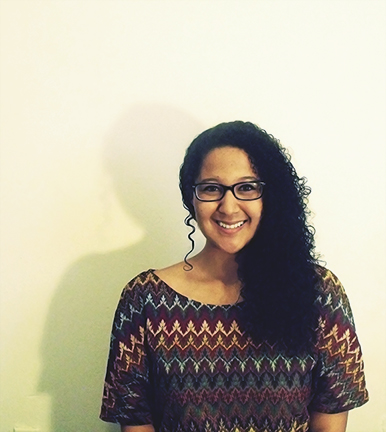
I was born in Frankfurt, Germany. My parents were in the military, which resulted in somewhat frequent moving. I resided in Washington D.C. for about 6 years until I moved to Richmond, Virginia to attend Virginia Commonwealth University.
My interest in design originated in the 6th grade. For anyone who doesn’t know, Neopets is a virtual pet community. I would be on this site for hours, tweaking different layouts to my desire. I started to expand my horizons and dig into image manipulation. As my small hobby started evolving, so did my curiosity for design. My high school did not offer any graphic design programs, so I sought assistance from college professors. They provided me with a great foundation of basic design principles and process.
My second year in the graphic design program at VCU is where I truly found a love for branding. We were given a project where we were to create a mark for three characters of The Wizard of Oz. I chose Dorothy, the Cowardly Lion, and Glinda the good witch. We had to translate each character’s traits into their own unique marks and calling cards. This assignment showed me the value of the design process. That process is essential to the outcome of the brand.
What were your thoughts when you started to think about branding Digital America? How did you begin the creative process?
When first starting this project, my partner Erin and I focused on the word “digital” and “multimedia”. We compiled a list of words and multiple sketches to create a unique concept for the brand. The idea of digitization can be translated into so many different things. We wanted to make sure that we found a concept that represented the company.
The creative process really took off while reflecting on a two-hour bus trip. While riding the bus I focused on two things: the power outlets and WiFi. The outlets lead to me thinking of electricity, while the WiFi made me think about signals. These two ideas started to mesh together in sketches, which help lead to the final product.
What do you think is really important when developing a brand?
Great concept and process lead to successful branding. The design process consists of analyzing the company’s needs and providing a creative solution. The result leaves us with an original concept. Another important thing to consider when developing a brand is detail. After I have a good concept down I make sure to align, tighten, and evenly distribute space in the logo before releasing it into the world.
What was the best part about the process? The worst?
It was an absolute pleasure working with Erin. We were able to come together and build off each other’s ideas almost fluidly. The best part was when we were able to gather inspiration on our own and bring it together to form a solution.
The biggest tackle was narrowing a direction to go in. The word “digital” can be associated with so many concepts. Our final solution was to incorporate digitalization with the journal’s tagline: “Millennials thinking critically about now”. Taking notice of our current technology really helped to conceptualize the logo.
What are doing now that deals with branding?
Recently, I’ve done a couple of branding projects with my current internship. I’m also working on my own personal logo and portfolio site. I created a logo a couple years ago, but I would love to revamp it. [Check out Sarah on Behance: http://bit.ly/1g5LWNB]
Branding Digital America
Word List for Digital America:
Bold Edgy Youthful Unique Digital Culture Beliefs Cutting edge America Students Perspective Millennials Art Creative Globalization Celebrate Pushing boundaries
Font Ideas:
Colorful lowercase Tall (condensed and skinny –makes you think of buildings, city, youthful?) Pixilation to represent diversity Bold and square letters Sharp
Keywords:
(Digital) highway, pixel, space, skyscraper
(America) diversity, opportunity, ribbons
Ideas:
We want to have a colorful logo (to represent diversity)
Font: lowercase, square, bold to depict something young; or tall and condensed to depict skyscrapers and opportunity
Refining…

See if you all are inspired with the DigA idea–it was an idea that a designer friend of mine offered and I thought we could play with it. I agree with your assessment on the bi-line for the logo. Let’s just stick with one with Digital America and one for the thumbnail.
Thanks for all of your hard work. It’s really exciting to see the ideas evolve! – Meghan
We’re all going to play with the DIGA idea this week and see what we come up with. Sarah and I are meeting Thursday and Preston and I are meeting again on Sunday. Hopefully we get some good ideas. For the logo on the main page, I think it would be a good idea to keep it simple and short, without the “Digital America Millennials critically thinking about now” text. I feel like it’s a lot to put on a logo, and more ideas could come from keeping all the text out since it is so much. It’s just a thought that came across today. Tell me what you think? – Erin
Here is another concept. Are you familiar with the sharing icon used typically for phones? It’s a very simple icon that depicts networking. It starts with one person and branches to multiple people. I still think that networks are really important to the Digital America brand. I took the “A” in the DigA and transformed it into the branching icon. I also made it look similar to the design of a circuit board. This icon is very current and represents the 21st generation pretty well in my opinion. Everything is very instant and sharing through social networks is pretty much the norm today.
Thoughts? Confusion? Ideas?
Number 6 is my favorite also. We came up with it by just playing around trying to make the “A” into a tower, but still make it look like an “A.” What really finalized my decision was by us taking the dot off the “I.” It makes the logo appear cleaner and neat. – Sarah
So it looks like we are going to go with 6, but let’s try it without the extra line. (So, it would be like #1 without the dot). We need to now move forward with: an image that says Digital America in the same font with the lightening bolt, a favicon, and some different size images to work with. – Meghan
Here are two ideas we came up with. We pulled the hook of the “G” up so that it appears to be tight and more in line. Also, we played around with the “Digital America” in these two logos. Let me know what you think or if this is something you do not want/like. – Sarah
Cool! What would it look like if we pumped the G up and the text was even underneath? I know that everyone thought the G flush with the top was weird, but I kinda liked it…I think it should be tight, nonetheless. (Like the yellow one from the first sheet. Thoughts? Too much going on? I just think the text is too low in this one.) – Meghan
We think that the lowercase “g” in the first yellow one we showed you is just funky and unexpected. The only way it’d look better is if we used different colors to make the logo look more colorful and youthful. Otherwise that particular logo in black just makes it look weird and out of place. Would you want us to play with the use of colors in the logo, or just keep it simple and black? – Sarah
Attached to this email are the following final images:
-180×180 thumbnail (black on white)
-180×180 thumbnail (invert)
-Whole logo (PNG)
-Raw file
-16×16 Favicon
When Erin and I reviewed the whole logo we were concerned about the “Digital America” underneath the DigA looking a little off. We took the type and put it in all caps to help with alignment. I really think this helps to bring the whole logo together. Please let me know how you feel about the final images! I can revise some images tomorrow. – Sarah
Still working
As we update the first issue with new content, Sarah is continuing to add custom elements to the design. A catalog of her work on this issue will be added to The evolution of Digital America as we transition to Issue no. 2 (Winter 2014).
[portfolio_slideshow id=213]