
Final Thoughts on the Project
How many US troops do you think are currently stationed in the United States? What about Vietnam? South Africa? Guam? What if I asked how many were stationed in Italy in, say, 1971?
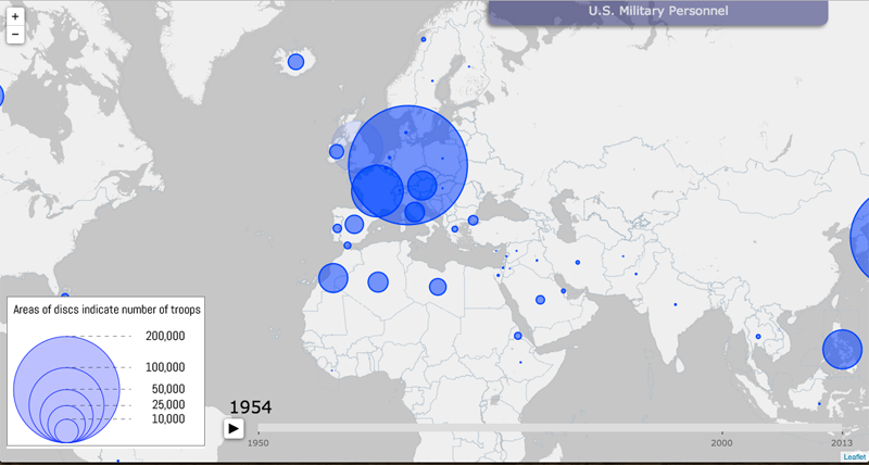
The students in Professor Tim Barney’s “The Rhetorical Lives of Maps” class recently finished their final project for the semester: an interactive map showing the numbers of US troops scattered across the globe during any given year since 1950. The map uses blue circles that are proportionally scaled to depict the amounts of troops in each country.
Using their data, you can scroll over to Vietnam and watch as tiny circles from 1962 explode into giant blobs of blue as the Vietnam War escalated during the latter half of that decade. You can also fast-forward to 1989-1991 to see the number of troops in Iraq increase dramatically during the Gulf War.
While Barney admits that the map, which is currently a draft of what the Digital Scholarship Lab will end up building, is still experiencing some kinks in the data. Additionally, there are additional features that will improve the experience. In the final product, the inclusion of pie charts will allow for users to read more data for each particular country.
“It’s really cool to finally see this stuff projected,” Barney said, “and it got the class all jazzed up last week. We had a great discussion about the strengths and weaknesses of our process and the product, but there was a general agreement of, ‘Wow! We actually did this!'”
UR students and faculty can check out the draft of their map project below. For those who are not on the University of Richmond campus network, check back in the future to be able to access the interactive program (it is only a test server at the moment).
“The Rhetorical Lives of Maps” Draft of the Final Product
Monday, March 17th, 2014. Ryland Hall 500. Snowy Conditions Three Days Before Spring.
by Andrew Jones
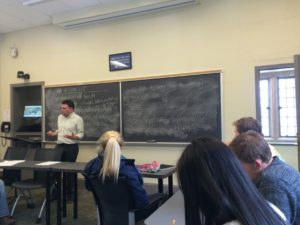
I walked into one of the few locations I had yet to explore on the University of Richmond campus. The entire top floor of the tower of Ryland Hall, a 100-year-old building that houses the English and History departments, was dedicated to a single classroom with large bay windows on three of its walls. As the rest of the class arrived, I could hear them joking about the difficult journey that we were forced to endure while climbing the seemingly endless string of stairwells. A particularly quirky setting for an even quirkier class experience.

We started off by discussing a map of the Atlantic Ocean that the students had studied during the break. Professor Tim Barney asked the students in his “Rhetorical Lives of Maps” First-Year Seminar to think about ways that science and the military constrained cartography during the Cold War, and the answer was explained using two terms: “soft power” and “hard power” (the former involves economics, natural resources, values, domination, and diplomacy, while the latter is usually associated with military strength).
Bruce Heezen and Marie Tharp had created the first map of the Atlantic Ocean in 1959 withassistance from a combination of academic science (Columbia Laboratory), the US Navy, and AT&T/Bell. Cold War strategic interests were behind this cartographic collaboration; the US Navy represented the hard power, and each organization that was involved had very different interests. Bruce & Marie were at the mercy of the powers that be.
Professor Barney explained that cartography is gendered; mapping is a socially constructed process, and tensions arose between Bruce and Marie involving Tharp’s status as a woman in a predominantly male enterprise. An article about their map in the New York Times referred to the two names in conjunction with each other only once, and the author referred specifically to Bruce Heezen and his achievements for the rest of the piece. Although the map of the Atlantic Ocean was huge news when it was released and had wide circulation, Marie Tharp didn’t receive very much credit for her artistic interpretation and hard work. She was disrespected throughout her life and didn’t even receive the same security clearances that Heezen enjoyed.
The main takeaway from this example is that masculinity is one manifestation of power in cartography. The map of the Atlantic Ocean reveals the plethora of Cold War powers struggling for dominance, and it is also representative of cultural shifts and gender inequalities. Professor Barney says that “the Heezen/Tharp map was, in some ways, the ocean floor” for millions of people at the time. Similar to the impact that Birth of a Nation had on moviegoers at a time when that film was the definitive portrayal and interpretation of the history of the American South, the map was a rhetorical artifact that provided a geographical imagination for us.
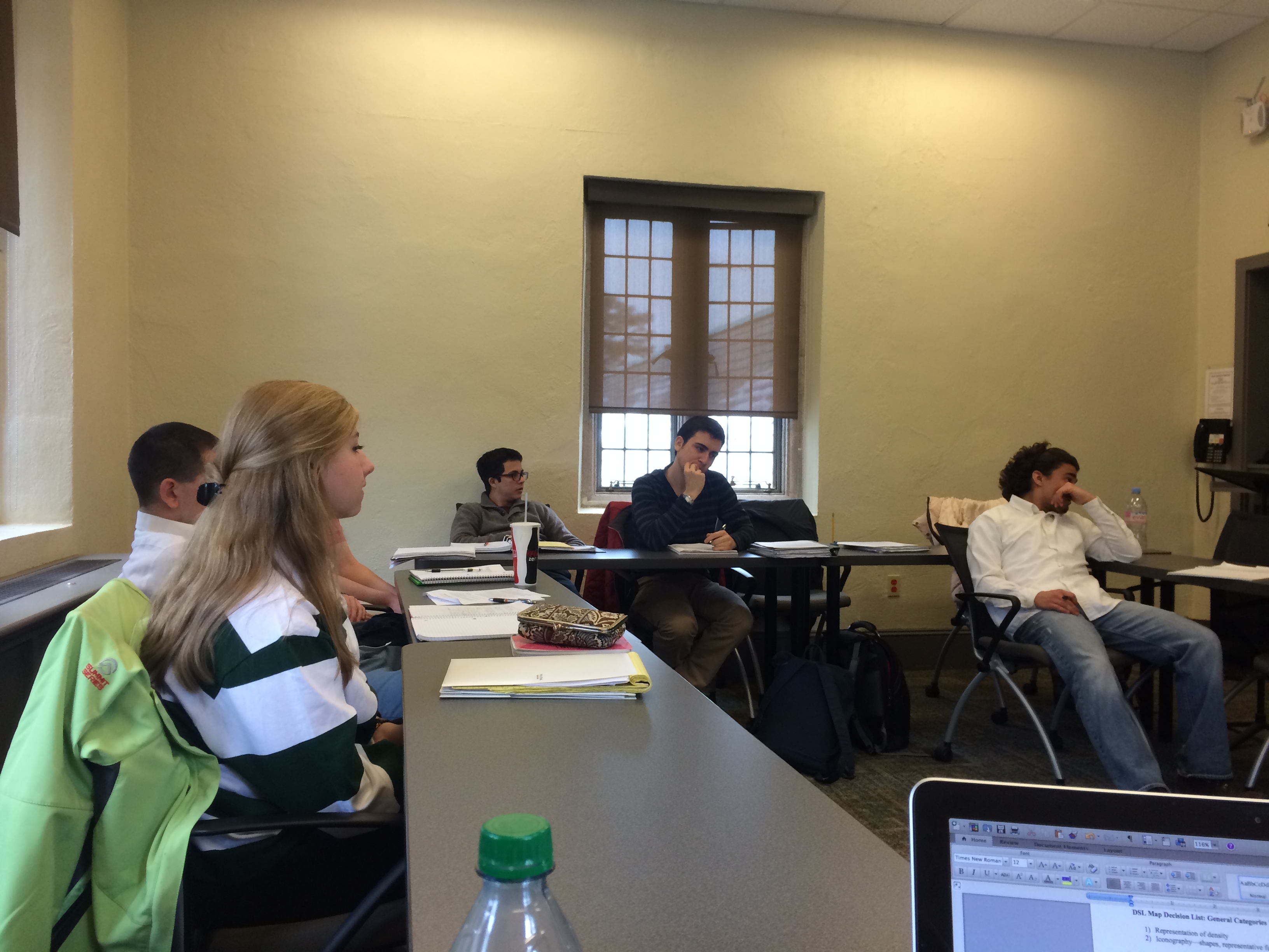
With this subtle reference to the course’s title serving as an end to their (extremely interesting) conversation, Professor Barney shifted the topic around to begin discussing their group projects. Students had handed in spreadsheets tracking United States “hard power” all around the world from 1950-2013. Their data indicates the expansion and contraction of active duty personnel around the world, and their findings were broken down by two main categories: the country being occupied, and whether the occupying personnel belonged to the US Navy, the US Marines, or the US Air Force.
This would all come together at the end of the semester to form a playback map of the world from 1950-2013 to see the expansion of military forces around the world. The University of Richmond’s Digital Scholarship Lab (DSL) is currently working with the spreadsheets that Professor Barney’s students turned in, and the class was now tasked with working on the bigger picture.
The amount of decisions that needed to be considered were extensive, so they began to list them off in no particular order.
DSL Map Decision List: General Categories That Must Be Accounted For
1) Representation of density
2) Iconography—shapes, representative figures
3) Location within nation/territory
4) Location/designation of nations through time
5) Level of detail for totals/division
6) Hierarchy?
7) Ration of country sizes—can they change?
8) Projection of the map—size
9) Color used to the student’s advantage
10) Text on the map
11) Data gaps–depicting countries that disappear (Cuba in the 1970’s); needs representation
12) Perspective/zoom function
13) Special features for interaction
14) How cluttered the maps will be
I was feeling more and more stressed out as the list grew larger in size, but the students seemed to be fully aware of the challenges that they were confronting. At one point the entire class freaked out when a student suggesting using dots as their primary form of iconography; apparently, dots were decidedly out of the question and colors were now in. The student sank down into his seat and began to reexamine his stance.
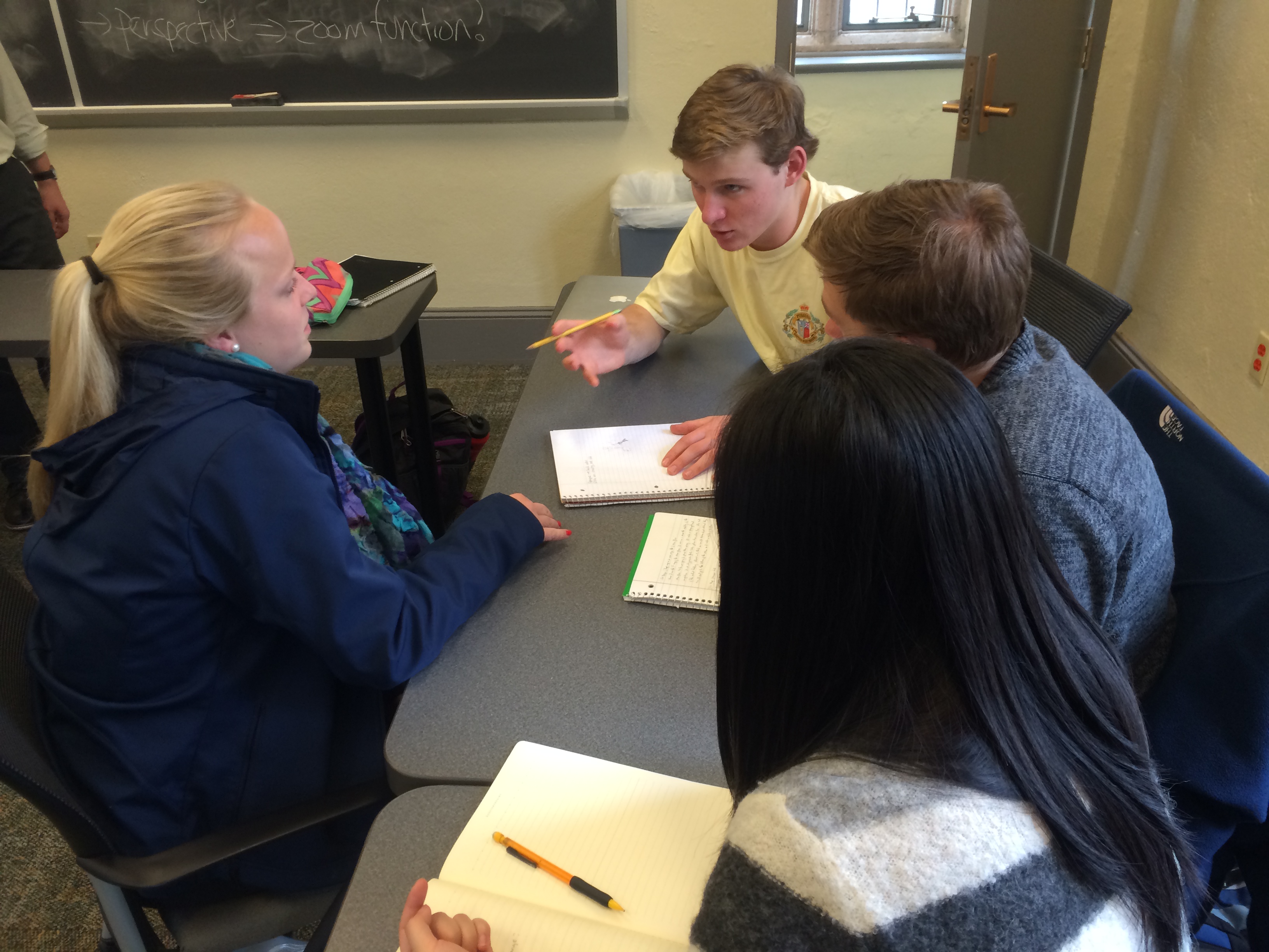
Because their groups are still in the planning stage, no final decisions were made that day. However, Professor Barney tasked them with coming up with definitive decisions for many of the issues in the list above. By doing so, the students will be able to come into class and see the similarities and differences between their opinions. The folks at the Digital Scholarship Lab will have the final say in terms of what can and cannot be done, but having a set list of things that the students want to try to accomplish is going to be very helpful.
I spent some time listening in on each group’s discussions and compiled a brief list of “sound bytes,” if you will. There are four teams of students with group names that correspond to the years that they are focusing on: Classic Cold War (1950-1968), Team Trouble for America (1968-1983), New World Order (1984-1999), and Globalization (1999-today).
Team Globalization
“We should use a color spectrum instead of dots; too many colors would diminish the sophistication of the map.”
“Clicking on the country can bring up background info, enabling us to keep the map looking crisp and clean.”
“The break-up of the Soviet Union may look confusing with all of the newly introduced countries on the map. We’ll need to take that into consideration.”
“On the surface of the map, do not show numbers. The smallest numerical category will be white (this is referring to the countries with the smallest numbers of US troops occupying their regions).”
Team Trouble for America & Team Classic Cold War (mixed together due to students who missed class)
“When discussing colors, we’ve decided on using no shapes for our iconography.”
“Disappearing borders? What happens to countries with borders that evolve and change over time (i.e. the USSR)?”
“Need to figure out how to represent countries with the smallest amounts of US troops (in order to not diminish the colors representing higher troop numbers).”
“We can use a dynamic map that moves its borders depending on the year, or keep it static to make it easy to comprehend for the casual viewer.”
Team New World Order
“The most important thing to consider is range: where should we set the baseline color/number for the smallest countries?”
“How to represent the range: one color? Yellow=0-100 troops (proportionally), Blue=100-1000, etc.”
“Loud colors will draw attention to particular countries, so that will impact the colors chosen for the smaller ranges (yellow wouldn’t be good for a small country)”
“We want to make it known which countries have 25,000 troops at first glance. People shouldn’t have to dig too deep to interpret the map.”
At the end of their group meetings (which lasted about 15 minutes at the end of class), Professor Barney asked them if they had any lingering problems that other groups needed to consider. One team said that a big issue was whether or not the map should have dynamic borders, and if they were to decided between dynamic and static they must be able to embrace and own that idea/technique. Another group brought up the problem with colors in terms of differentiating the plethora of countries that will be represented. Because many will be sharing the same colors, the teams must be able to either alter the ranges to allow for a more diverse array of colors or clearly mark the borders to let the countries stand out from the common colors.
Overall, though, the students seemed to be fully capable of coming up with some solutions before their next meeting. Many were scheduling meeting times that worked for every team member, and others were still discussing their ideas as they descended the endless staircases within Ryland Hall’s iconic tower.
Some info on the course
Tim Barney, Assistant Professor of Rhetoric and Communications at the University of Richmond, warns his students right away. The freshman seminar course “The Rhetorical Lives of Maps!” is going “nerd deep” into maps. He explains (better than we ever could):
While we will look broadly at how maps became important historical markers of politics and identity from the dawn of the 1900s right into our young 21st century, we will also treat this course as a primer in how to read maps for their symbolic codes, political messages, and historical impacts. We have a course philosophy based around the notion of “nerd-deepness.” In other words, we’re going to look at maps in the kind of depth that you probably thought was never possible—and if it was possible, it would only be for nerds.
Well, let’s accept that it’s OK to be a “map nerd” in this course. Maps are especially compelling because they seem to be all about the surface—what you actually see and perceive on that flat page should tell you all you need to know, right? Well, going nerd deep into cartography questions what the assumptions of those surfaces are, and even requires looking at how the maps were made, used, and circulated into important political contexts. Each part of the mapping process is political and involves the rhetorical choices of a variety of different, sometimes conflicting interests. In short, maps have lives. Our job as nerd-deep rhetorical critics in this course is to trace those lives, and to go even deeper to think about what it means to perceive the world spatially.
Digital America will follow the progress of the course’s blog Mappenstance. Every week a student or two will be responsible for curating the blog. Students are responsible for posting a “Map of the Week,” an “Atlas of the Week,” as well as a link to another map-related site. The weekly updates will also include a critique by one of the students that is reviewed by Prof. Barney to ensure quality and thoughtfulness. Digital America will not only follow their blog, but also their map making–starting off with last semester’s map project produced in conjunction with the Digital Scholarship Lab and leading up to the final project of the spring group. More specifically, the spring map will “look at the expansion and contraction of military power….So our map will conceivably see what the density of American military expansion looks like all over the work in the second half of the twentieth century.”
So, check out their awesome project from fall 2013, follow along as the spring 2014 class contributes more insights to the blog, and be sure to check back at the end of the semester for the final project.
All hail the map nerds.
Course Stats
Professor: Tim Barney
Institution: Rhetoric and Communications @ The University of Richmond
Course: The Rhetorical Lives of Maps!
Project: DSL map project; Mappenstance class blog
Participants: Students split up into groups based on time period (Cold War of the 50’s and early 60’s, Vietnam and other interventions, Reagan-era/End of Cold War, 9/11 atmosphere-Today)
Mappenstance blog: http://blog.richmond.edu/livesofmaps/
We realized that some of the best places to find cool maps and great analyses of them is actually through blogs. Some fascinating stuff is getting posted and then circulated, so we thought, why not do one of our own? That’s how we started the Mappenstance blog. – Prof. Barney
Map from last semester: http://minard.richmond.edu/USDiplomacyMap/
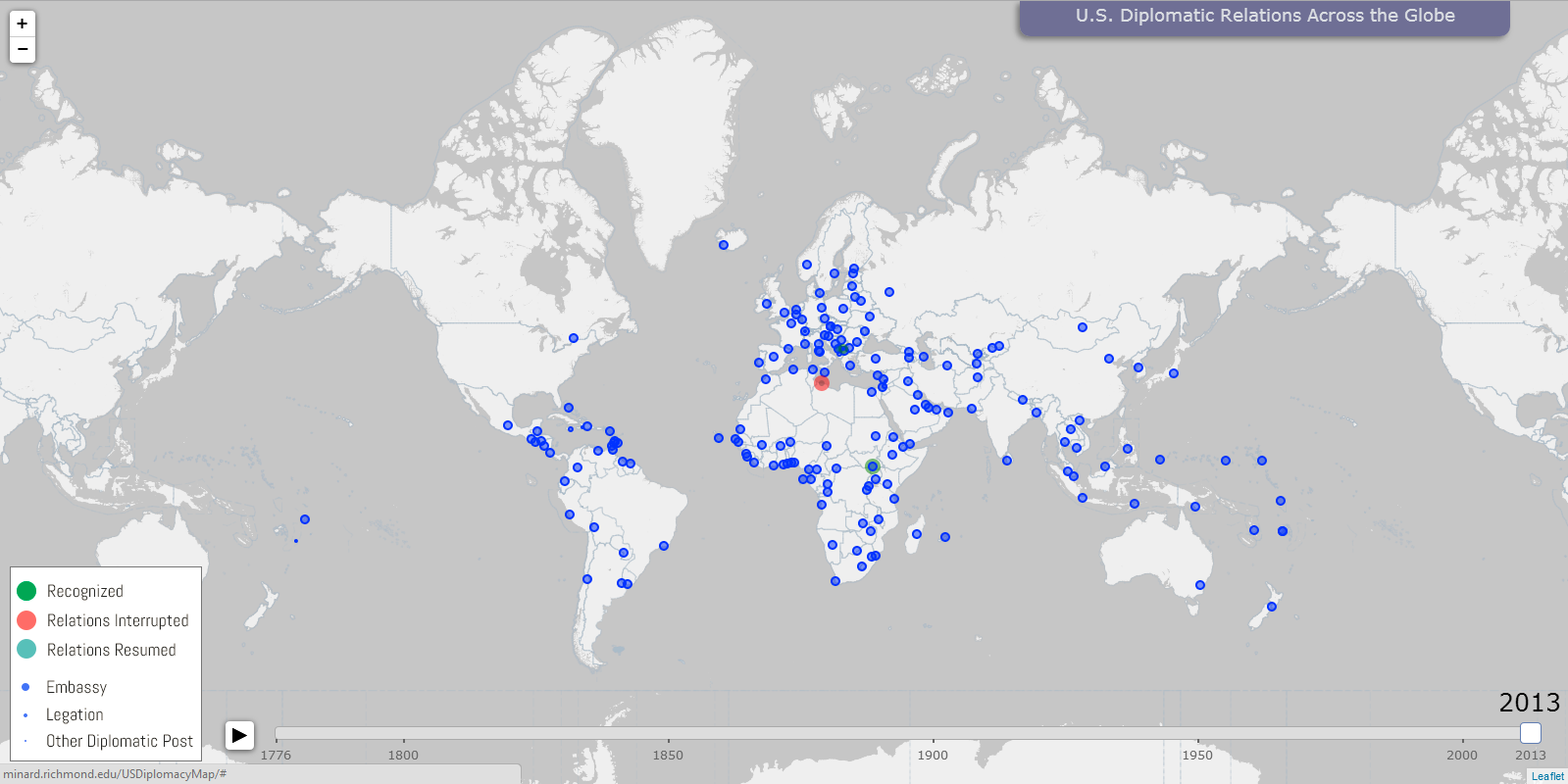
One of the main projects students collaborate on is our DSL map project. With the Digital Scholarship Lab, we have students compile and analyze historical data, and then help make the cartographic choices that go into the map. Last semester, we sought out to map the history of U.S. Diplomatic relations by plotting the establishment of embassies from 1789 through 2013 using State Department data. Students were part of a regional team (Asia, Europe etc.) and they compiled spreadsheets that tracked the location and years the embassies were established, among some other important historical information. Each team also offered a proposal (set of specifications) on how they thought the overall map should look and what kind of bells and whistles it should have. The DSL translated all this into our final map. Individually, they also worked on research essays—because we felt a strictly quantitative picture on the map wasn’t going to do full justice to the diplomatic complexities. So they picked out of their region some sort of controversial or compelling part of American diplomatic relations (maybe the closing of an embassy, or the outbreak of violence in an area, or more positively, the important diplomatic recognition of a nation at an influential point in time). For this semester, we’re now working on a question surrounding “hard power”–since we got the softer, diplomatic end of power last semester, our map in Spring 2014 will look at the expansion and contraction of military power. We’re only as good as our data, so we found this fascinating set of Department of Defense reports annually that track the numbers of active duty personnel by country from 1950 to the current day. So our map will conceivably see what the density of American military expansion looks like all over the world in the second half of the twentieth century. We really have no idea what to expect yet, so that’s kind of both fun and nerve-wracking. Students will be split up by time period this time, so one group works in the classic Cold War of the 50’s and early 60s, the next group does America’s difficult 70s with Vietnam and other interventions, then we have the Reagan-era/End of Cold War, and finally the globalized world and 9/11 atmosphere leading into today. Similarly, they will produce essays about individual points of interest around American expansion. – Prof. Barney